Perspectives on AI, risk analytics, automation, and turning raw data into decisions that matter.

Most compliance failures don’t begin with fraud. They begin with poor data governance and data management; inconsistently defined metrics, lack of ownership, scattered calculations and methodology. Under the Corporate Sustainability Reporting Directive (CSRD), climate and sustainability disclosures are subject to structured reporting standards issued by European Financial Reporting Advisory Group (EFRAG) and increasingly aligned with International Sustainability Standards Board (ISSB) standards.

Modern risk and control dashboards rarely fail because of visuals. They fail upstream, where definitions drift, calculations get re-implemented, and data governance lives in spreadsheets or people’s heads. In this walkthrough, I demonstrate how Power BI’s MCP (Model Context Protocol) can be used inside Cursor to automate much of that foundational work. MCP (Model Context […]
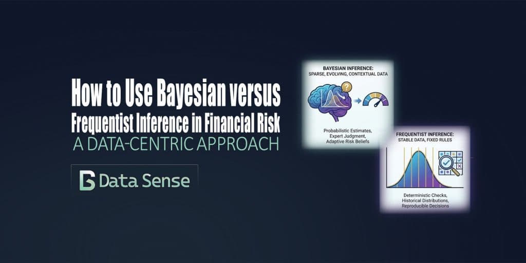
In financial risk management, debates about Bayesian versus frequentist inference are often framed as methodological or philosophical. In practice, the choice is far more pragmatic: it is primarily a data problem. Model risk, drift, and operational risk live upstream of market, credit, and liquidity models. They are shaped less by elegant theory and more by the realities of data volume, stability, and interpretability. This is where the distinction between frequentist and Bayesian inference becomes operationally meaningful.

Building a custom analytics dashboard usually means days of boilerplate: app scaffolding, callbacks, layout wiring, and database plumbing. All of that happens before you can even ask whether the dashboard is answering the right questions. This post walks through a small experiment: how far I could get building an Ironman training dashboard with Google Antigravity using minimal prompting, what that revealed about where LLMs accelerate dashboard development and where human judgment still matters most. The goal wasn’t a production-ready app. It was to shorten the distance between idea and working prototype.

A case study on a global derivatives dashboard. What started as a simple Tableau build ended up shaping future ETL automation, data scraping pipelines, and dashboards for years.

AI isn’t taking financial data analysts jobs, it’s changing the definition of them. In modern finance, the analyst’s role is evolving from reporting the past to predicting the future. Those who can harness AI-driven insights, automate workflows, and communicate results clearly are redefining what “analysis” means in the age of intelligent automation. For financial data analysts and data scientists, this shift brings new questions: Which skills are still essential? Which tools are becoming obsolete? And how do you stand out in a market where AI can write code, generate dashboards, and even summarize 10-Ks? This guide unpacks what the data and employers are saying, with practical insights on where the jobs are, which skills are most in demand, and how to upskill effectively to future-proof your career in finance and analytics.

Power BI has helped democratize dashboards by giving anyone, from aspiring data analysts to business managers, the tools to explore, visualize, and share insights. Building a Power BI dashboard that looks good is easy, but building one that actually works takes intention. In our last article, we looked at why most Power BI dashboards fail and the five common mistakes behind them. This time, let’s fix them with five practical, easy-to-apply Power BI tips you can use today.

Cross-border financial data remains fragmented, siloed, and difficult to use for proactive risk oversight. With new privacy, AI, and governance rules tightening globally, collaboration between financial institutions has become both necessary and technically complex. Federated learning is a promising framework for overcoming these challenges.

Power BI has helped democratize dashboard creation by giving anyone, from sales aspiring data analysts to sales managers all the tools to build a great dashboard. Sadly, most of these dashboards end up in a folder somewhere, never getting the attention they deserve. Sometimes the issue is design; cluttered layouts, overuse of color, inconsistent filters. Other times, the data itself is messy, misaligned, or misunderstood. The result? Dashboards that look impressive but fail to inform. I’ve reviewed hundreds of Power BI dashboards being posted on LinkedIn, and the same five mistakes show up again and again. Here’s how to fix them in minutes (no fancy visuals required).
