
Modern risk and control dashboards rarely fail because of visuals. They fail upstream, where definitions drift, calculations get re-implemented, and data governance lives in spreadsheets or people’s heads.
In this walkthrough, I demonstrate how Power BI’s MCP (Model Context Protocol) can be used inside Cursor to automate much of that foundational work.
MCP (Model Context Protocol) is an emerging standard that allows AI tools to directly inspect, reason over, and modify BI data models; including relationships, calculated fields, and semantic definitions.
While the demo uses a triathlon training dataset, the workflow is identical to what we apply to risk and control models… the domain changes, the modeling logic does not.
The Tooling Setup (Briefly)
We use an agent automation tool extension (Cline) in Cursor to plan and execute commands via the Power BI MCP server.
- Power BI MCP: Enables direct AI interaction with the Power BI semantic model
- Cursor (Cline): An AI-powered code editor that acts as the control surface for prompting, reviewing, and iterating on model changes
Rather than starting with charts, this workflow starts where risk reporting usually breaks down: the data model and its definitions.
What the MCP Automates
Using MCP inside Cursor, the workflow can:
- Review the database schema and identify relationships across risk, control, and assessment tables
- Generate calculated fields such as control effectiveness, residual risk indicators, and coverage flags
- Create definition tables that centralize metric logic and business meaning
- Standardize calculations so the same logic is reused consistently across reports
This shifts much of the modeling and governance burden away from manual, error-prone BI development and into a guided, repeatable process.
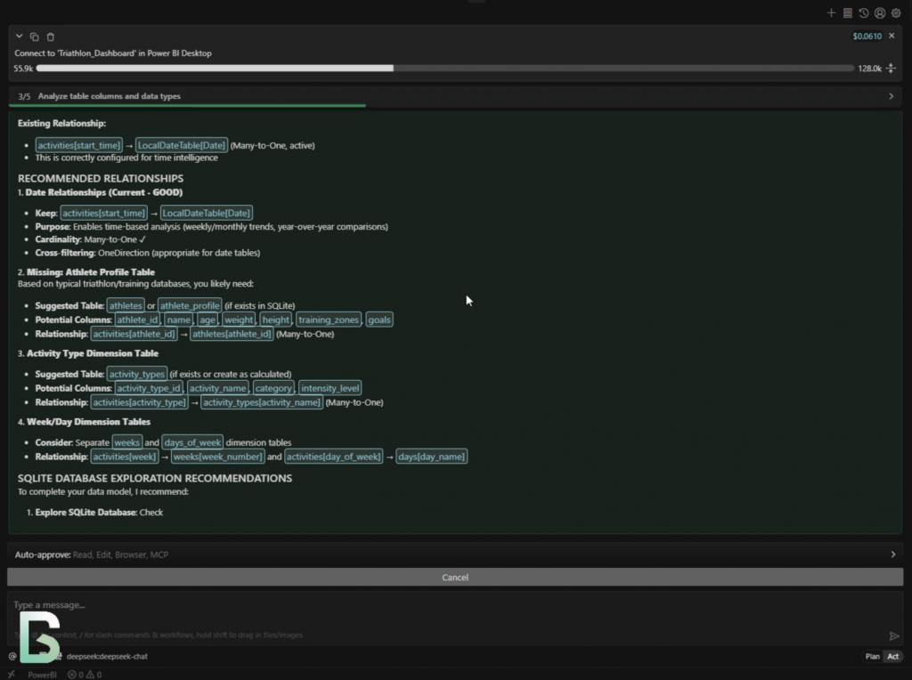
Here the MCP is identifying relationships between training sessions and athletes.
In a risk context, this is equivalent to mapping control executions to business units or processes.
Why This Matters for Risk & Controls
Risk dashboards tend to suffer from the same structural problems:
- Metrics mean different things to different teams
- Calculations are recreated slightly differently in each report
- Governance and auditability are bolted on after the fact
By pushing logic into definition tables and shared calculations, MCP-driven workflows enforce consistency before a single visual is created.
Because all metric logic lives in versioned definition tables, audit trails become trivial, and regulatory or internal reviews focus on validating logic rather than spelunking through report files.


While the demo dataset represents training activity, what matters here is what MCP is doing structurally, not the domain of the data.
In a risk and controls dashboard, this step is where MCP automatically generates model-level risk metrics such as composite control effectiveness scores, cumulative exposure indicators, and period-over-period trends. These calculations are created once, centrally, and reused consistently across all reports.
Time-aware logic (weekly, monthly, cumulative) is handled directly in the semantic model, ensuring that reporting periods remain consistent and defensible during audits or regulatory reviews. Enhancements to the date table standardize filtering by week, month, quarter, and year, eliminating one of the most common sources of inconsistency in risk reporting.
Categorization logic, shown here as activity groupings, maps directly to control taxonomies in a risk context. Controls can be grouped by domain, process, or risk category and enforced at the semantic model level rather than re-interpreted in each dashboard. For example, controls can be classified into Operational, Financial, or Compliance categories centrally, ensuring consistent roll-ups and comparisons across all risk dashboards.
Governance by Design at the Semantic Layer
Because all metric definitions and transformations live in the semantic model—not inside individual visuals—this approach improves auditability, reduces duplication, and embeds governance before a single visual is created. AI-assisted tooling is simply the mechanism that makes this practical at scale, allowing teams to review, refine, and standardize logic early in the lifecycle rather than retrofitting governance later.
Running this through Cursor (Cline) makes BI development feel much closer to software engineering:
- Model changes are explicit and reviewable
- Prompts and outputs can be iterated on quickly
- Definitions and calculations become versioned artifacts, not tribal knowledge
This is especially valuable in risk and compliance contexts, where traceability and consistency matter more than speed alone.


Demo Video
The short demo video walks through:
- Schema review and association discovery
- Calculated field generation
- Definition table creation
—all in under five minutes.
Final Thoughts
This approach is not about fully automating dashboards.
The real win is automating the boring, fragile, and governance-heavy parts of risk reporting, so analysts and risk managers can focus on interpretation and decision-making rather than debugging DAX or reconciling definitions.
If you’re building risk, compliance, or control dashboards at scale, this is worth experimenting with now.