-
 9 minutes
Creating an Ironman Training Dashboard with Google Antigravity
Read More ->: Creating an Ironman Training Dashboard with Google AntigravityBuilding a custom analytics dashboard usually means days of boilerplate: app scaffolding, callbacks, layout wiring, and database plumbing. All of that happens before you can even ask whether the dashboard is answering the right questions. This post walks through a small experiment: how far I could get building an Ironman training dashboard with Google Antigravity using minimal prompting, what that revealed about where LLMs accelerate dashboard development and where human judgment still matters most. The goal wasn’t a production-ready app. It was to shorten the distance between idea and working prototype.
-
 5 minutes
How to Get Hired as a Financial Data Analyst with AI (2025)
Read More ->: How to Get Hired as a Financial Data Analyst with AI (2025)AI isn’t taking financial data analysts jobs, it’s changing the definition of them. In modern finance, the analyst’s role is evolving from reporting the past to predicting the future. Those who can harness AI-driven insights, automate workflows, and communicate results clearly are redefining what “analysis” means in the age of intelligent automation. For financial data analysts and data scientists, this shift brings new questions: Which skills are still essential? Which tools are becoming obsolete? And how do you stand out in a market where AI can write code, generate dashboards, and even summarize 10-Ks? This guide unpacks what the data…
-
 4 minutes
Top 5 Power BI Dashboard Tips to Improve Your Reports Today
Read More ->: Top 5 Power BI Dashboard Tips to Improve Your Reports TodayPower BI has helped democratize dashboards by giving anyone, from aspiring data analysts to business managers, the tools to explore, visualize, and share insights. Building a Power BI dashboard that looks good is easy, but building one that actually works takes intention. In our last article, we looked at why most Power BI dashboards fail and the five common mistakes behind them. This time, let’s fix them with five practical, easy-to-apply Power BI tips you can use today.
-
 5 minutes
Why Most Power BI Dashboards Fail (5 Simple Fixes)
Read More ->: Why Most Power BI Dashboards Fail (5 Simple Fixes)Power BI has helped democratize dashboard creation by giving anyone, from sales aspiring data analysts to sales managers all the tools to build a great dashboard. Sadly, most of these dashboards end up in a folder somewhere, never getting the attention they deserve. Sometimes the issue is design; cluttered layouts, overuse of color, inconsistent filters. Other times, the data itself is messy, misaligned, or misunderstood. The result? Dashboards that look impressive but fail to inform. I’ve reviewed hundreds of Power BI dashboards being posted on LinkedIn, and the same five mistakes show up again and again. Here’s how to fix them in minutes…
-
 8 minutes
Dashboard Design Best Practices: From Charts to Clarity
Read More ->: Dashboard Design Best Practices: From Charts to ClarityOver the past few years, dashboards have become ubiquitous. Thanks to the “democratization of data visualization tools,” everyone is suddenly an analyst. With drag-and-drop interfaces and endless templates, it’s never been easier to pull data into a dashboard and share it with colleagues or executives. The problem? Most dashboards are bad. They don’t follow dashboard design best practices. You’ve probably seen them shared on LinkedIn: messy color schemes, overcrowded with charts, crammed into tiny panels, or spread across dozens of pages. They look neat, but they don’t communicate. At best, they confuse. At worst, they actively mislead.
-
 17 minutes
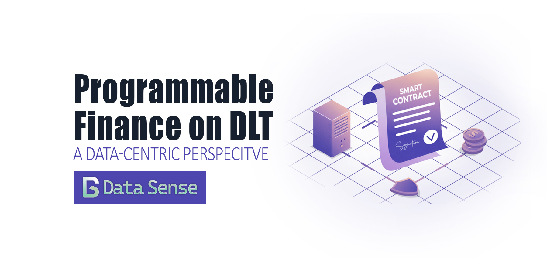
Programmable Finance on DLT: Data-Centric Perspective
Read More ->: Programmable Finance on DLT: Data-Centric PerspectiveIn this weeks article we discuss how distributed ledgers reshape settlement data, risk metrics, and privacy controls in financial markets. The rise of programmable finance on DLT is reshaping how financial institutions think about settlement, data governance, privacy, and risk. Unlike earlier blockchain hype, today’s experiments focus on the data foundations of trust: ensuring interoperability across rails, clear definitions of finality, and privacy-preserving analytics at scale.
BROWSE PAST POSTS
Blog Archives
Explore our entire collection of articles, organized by publication date.
Posts from
Data Analysis
View Year:
©2025 Data Sense. All rights reserved.