-
 4 minutes
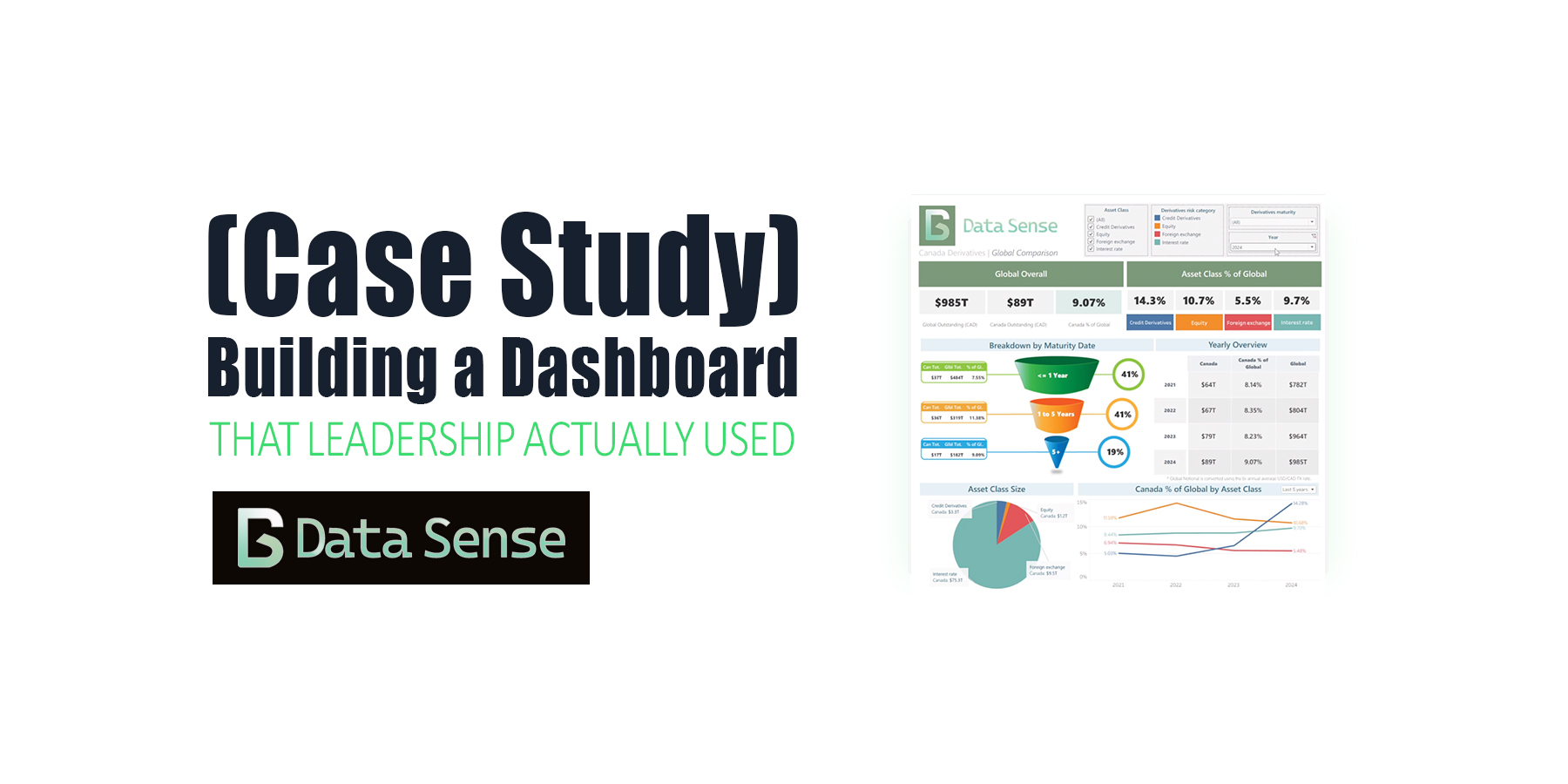
Building a Dashboard That Leadership Actually Used (Case Study)
Read More ->: Building a Dashboard That Leadership Actually Used (Case Study)A case study on a global derivatives dashboard. What started as a simple Tableau build ended up shaping future ETL automation, data scraping pipelines, and dashboards for years.
-
 4 minutes
Top 5 Power BI Dashboard Tips to Improve Your Reports Today
Read More ->: Top 5 Power BI Dashboard Tips to Improve Your Reports TodayPower BI has helped democratize dashboards by giving anyone, from aspiring data analysts to business managers, the tools to explore, visualize, and share insights. Building a Power BI dashboard that looks good is easy, but building one that actually works takes intention. In our last article, we looked at why most Power BI dashboards fail and the five common mistakes behind them. This time, let’s fix them with five practical, easy-to-apply Power BI tips you can use today.
-
 5 minutes
Why Most Power BI Dashboards Fail (5 Simple Fixes)
Read More ->: Why Most Power BI Dashboards Fail (5 Simple Fixes)Power BI has helped democratize dashboard creation by giving anyone, from sales aspiring data analysts to sales managers all the tools to build a great dashboard. Sadly, most of these dashboards end up in a folder somewhere, never getting the attention they deserve. Sometimes the issue is design; cluttered layouts, overuse of color, inconsistent filters. Other times, the data itself is messy, misaligned, or misunderstood. The result? Dashboards that look impressive but fail to inform. I’ve reviewed hundreds of Power BI dashboards being posted on LinkedIn, and the same five mistakes show up again and again. Here’s how to fix them in minutes…
-
 8 minutes
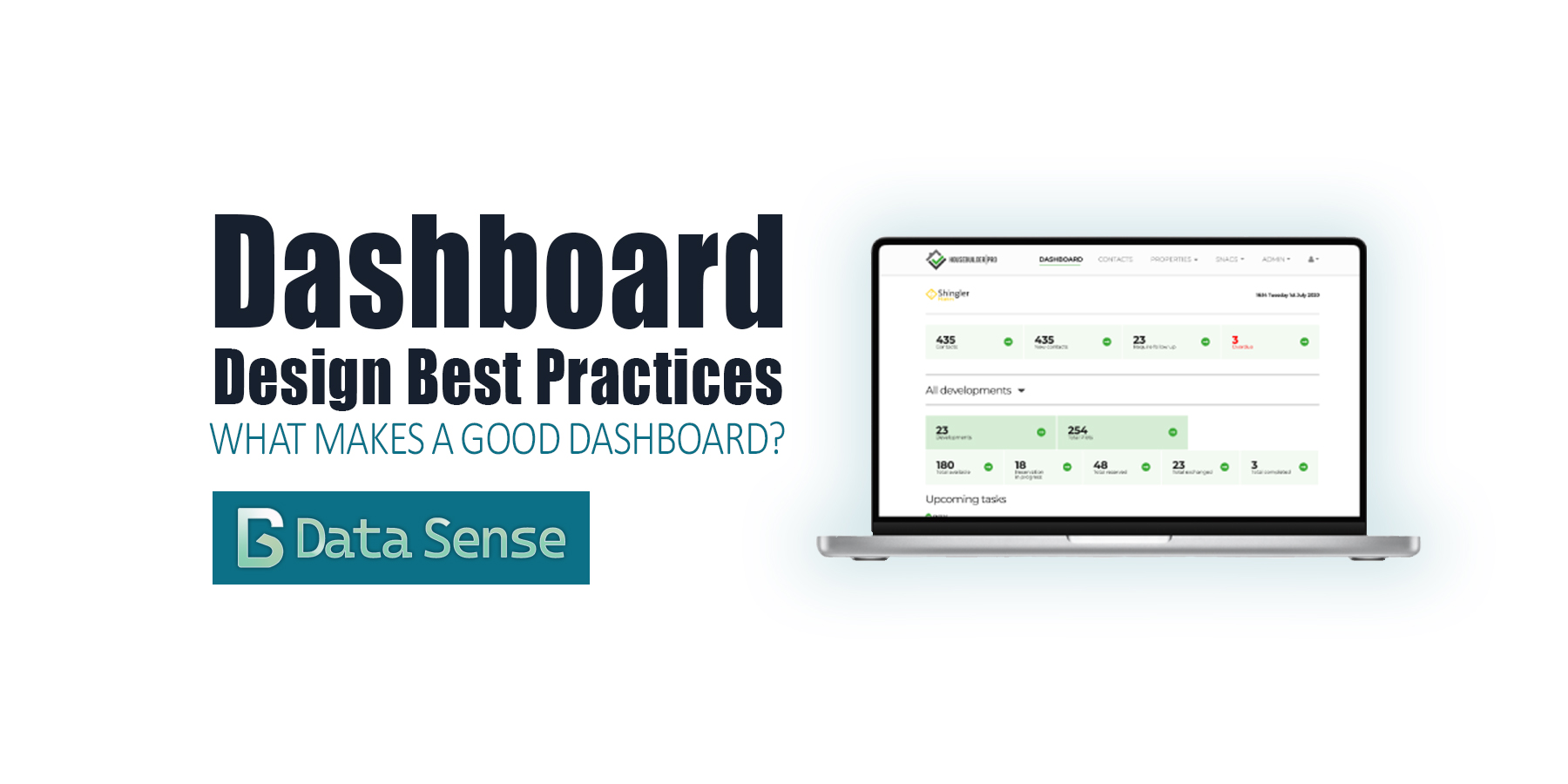
Dashboard Design Best Practices: From Charts to Clarity
Read More ->: Dashboard Design Best Practices: From Charts to ClarityOver the past few years, dashboards have become ubiquitous. Thanks to the “democratization of data visualization tools,” everyone is suddenly an analyst. With drag-and-drop interfaces and endless templates, it’s never been easier to pull data into a dashboard and share it with colleagues or executives. The problem? Most dashboards are bad. They don’t follow dashboard design best practices. You’ve probably seen them shared on LinkedIn: messy color schemes, overcrowded with charts, crammed into tiny panels, or spread across dozens of pages. They look neat, but they don’t communicate. At best, they confuse. At worst, they actively mislead.
-
 10 minutes
Synthetic Data in Financial Services: Reshaping Risk
Read More ->: Synthetic Data in Financial Services: Reshaping RiskAs synthetic data in financial services gains momentum, evidence from the Financial Conduct Authority (FCA), the European Commission (EC), and central-bank forums shows it can help close cross-border visibility gaps in risk monitoring and systemic oversight When Lehman Brothers collapsed in September 2008, supervisors around the world struggled to see how risks were propagating through interconnected balance […]
-
 13 minutes
Telling Amazing Stories with Data
Read More ->: Telling Amazing Stories with DataThe secrets of story telling There is nothing worse than a presenter who throws up a PowerPoint and begins to read off the screen. Despite how good the presenters data and analysis may be, the presentation comes off as dull and boring and leaves the audience with little recollection of the information. There’s an art […]
CATEGORY ARCHIVES