-
 9 minutes
Creating an Ironman Training Dashboard with Google Antigravity
Read More ->: Creating an Ironman Training Dashboard with Google AntigravityBuilding a custom analytics dashboard usually means days of boilerplate: app scaffolding, callbacks, layout wiring, and database plumbing. All of that happens before you can even ask whether the dashboard is answering the right questions. This post walks through a small experiment: how far I could get building an Ironman training dashboard with Google Antigravity using minimal prompting, what that revealed about where LLMs accelerate dashboard development and where human judgment still matters most. The goal wasn’t a production-ready app. It was to shorten the distance between idea and working prototype.
-
 4 minutes
Top 5 Power BI Dashboard Tips to Improve Your Reports Today
Read More ->: Top 5 Power BI Dashboard Tips to Improve Your Reports TodayPower BI has helped democratize dashboards by giving anyone, from aspiring data analysts to business managers, the tools to explore, visualize, and share insights. Building a Power BI dashboard that looks good is easy, but building one that actually works takes intention. In our last article, we looked at why most Power BI dashboards fail and the five common mistakes behind them. This time, let’s fix them with five practical, easy-to-apply Power BI tips you can use today.
-
 8 minutes
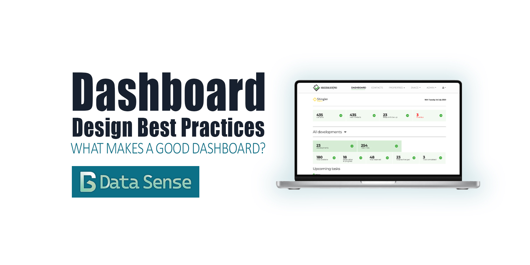
Dashboard Design Best Practices: From Charts to Clarity
Read More ->: Dashboard Design Best Practices: From Charts to ClarityOver the past few years, dashboards have become ubiquitous. Thanks to the “democratization of data visualization tools,” everyone is suddenly an analyst. With drag-and-drop interfaces and endless templates, it’s never been easier to pull data into a dashboard and share it with colleagues or executives. The problem? Most dashboards are bad. They don’t follow dashboard design best practices. You’ve probably seen them shared on LinkedIn: messy color schemes, overcrowded with charts, crammed into tiny panels, or spread across dozens of pages. They look neat, but they don’t communicate. At best, they confuse. At worst, they actively mislead.
-
 8 minutes
The Democratization of Data Visualization: Lessons from Plotly
Read More ->: The Democratization of Data Visualization: Lessons from PlotlyFor decades, data visualization was the guarded domain of BI specialists, statisticians, and data analysts. If an executive wanted a dashboard or a policymaker needed an analysis, they had to request it through a central analytics team and wait days or weeks for results. That world is gone. Today, thanks to platforms like Tableau, Power BI, and open-source frameworks such as Plotly Dash and Plotly Studio, almost anyone can spin up an interactive dashboard. This shift, known as the democratization of data visualization, promises faster insights, broader participation, and fewer bottlenecks from overworked data teams or gaps in expertise.
-
 13 minutes
Telling Amazing Stories with Data
Read More ->: Telling Amazing Stories with DataThe secrets of story telling There is nothing worse than a presenter who throws up a PowerPoint and begins to read off the screen. Despite how good the presenters data and analysis may be, the presentation comes off as dull and boring and leaves the audience with little recollection of the information. There’s an art […]
-
 12 minutes
The Popular Trends in Data Visualization in 2025
Read More ->: The Popular Trends in Data Visualization in 2025In the rapidly evolving field of data visualization, staying ahead of trends can be difficult for professionals seeking to create impactful and insightful visual content. As we progress through 2024, several key trends are shaping the way we visualize and interpret data. Here we discuss the four most significant trends that are influencing data visualization today and will continue to do so in the coming years.
CATEGORY ARCHIVES