Building a custom analytics dashboard usually means days of boilerplate: app scaffolding, callbacks, layout wiring, and database plumbing. All of that happens before you can even ask whether the dashboard is answering the right questions.
This post walks through a small experiment: how far I could get building an Ironman training dashboard with Google Antigravity using minimal prompting, what that revealed about where LLMs accelerate dashboard development and where human judgment still matters most.
The goal wasn’t a production-ready app. It was to shorten the distance between idea and working prototype.
From Training Data to a Dashboard Problem
I’ve been using LLMs to help plan and refine my Ironman training based on established training science, specifically Joel Friel’s work (I own The Triathlete’s Training Bible).
Using a newer Garmin Python library, I extracted my training data, structured it, and stored the relevant fields in an SQLite database. At that point, the next logical step was obvious: creating an Ironman training dashboard to track progress over time, and eventually embed an LLM directly into that dashboard to help reason about the data.
This is usually where things slow down.
Instead of immediately reaching for a pre-made Plotly Dash template or spending time wiring everything together by hand, I decided to see how far I could get creating the dashboard with Google Antigravity, giving it minimal direction and effort.
The Prompt I Used to Create the Dashboard with Google Antigravity
The Prompt to Create the Dashboard with Google Antigravity
I kept the initial prompt intentionally lightweight.
The goal wasn’t to design the perfect dashboard with Google Antigravity, but to get a working Plotly Dash app as quickly as possible that was connected to my database, with basic interactivity and sensible defaults.
Rather than starting with code, I started with intent.
I described the data at a high level; workouts are stored in an SQLite database, aggregated weekly, and outlined the structure of the dashboard I wanted to end up with. Not pixel-perfect design, just the functional pieces:
- A top row with KPI cards:
- Weekly training hours
- Weekly TSS
- Current training status
- Filters for:
- Week
- Sport
- A set of core charts:
- A time series showing daily training duration by sport
- A distribution view of how time was spent across sports, with a deeper breakdown by workout where available
- Callbacks that would eventually allow clicking into individual activities (even if that page was just a placeholder for now)
At this point, nothing had been coded. This was still just structured intent.
Within about four minutes, Antigravity responded with a detailed implementation plan complete with a wireframe and technical specifications.
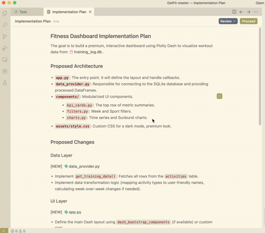
This was fairly impressive in itself, I like how it highlighted the specific functions and the tables in the database that it would pull the information from. It was clear that it was able to read the structure of the project I had already created and develop on top of it.
The nicest part was the ability to comment on specific parts of the implementation plan and tweak the result.
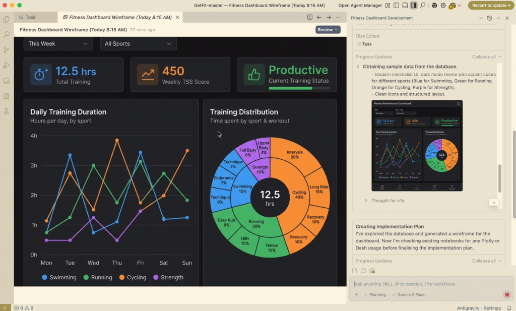
After another 4 minutes, Antigravity had outputted the completed Plotly Dash app, with callbacks and everything.
From a purely technical standpoint, this was the biggest win. The hardest, most tedious parts of standing up a Dash app were already done.
- A functioning Plotly Dash app
- Fully wired callbacks
- Database integration that worked out of the box
- A complete set of charts covering volume, intensity, and distribution
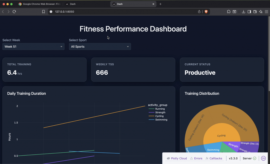
The Dashboard with Google Antigravity (Fast, Functional, but Rough)
Dashboard with Google Antigravity First Output
The first working version was fairly good, but it was missing some key connectivity features and design elements.
The app looked good, but technically there were some holes:
- It loaded data correctly
- Filters didn’t work
- Charts didn’t update as expected
- The layout was wrong
Visually and structurally, it wasn’t telling a clear story. It required some additional prompting to get things where we needed to be.
Everything was stacked vertically. Important information competed for attention. There was no strong hierarchy guiding the user toward what mattered most. All these are critical elements discussed in our article on Dashboard Design Best Practices.
This was exactly what I expected from minimal prompting. And for having produced this in less than 10 minutes, it was still far ahead of where I would have been had I started from scratch, even with a template.
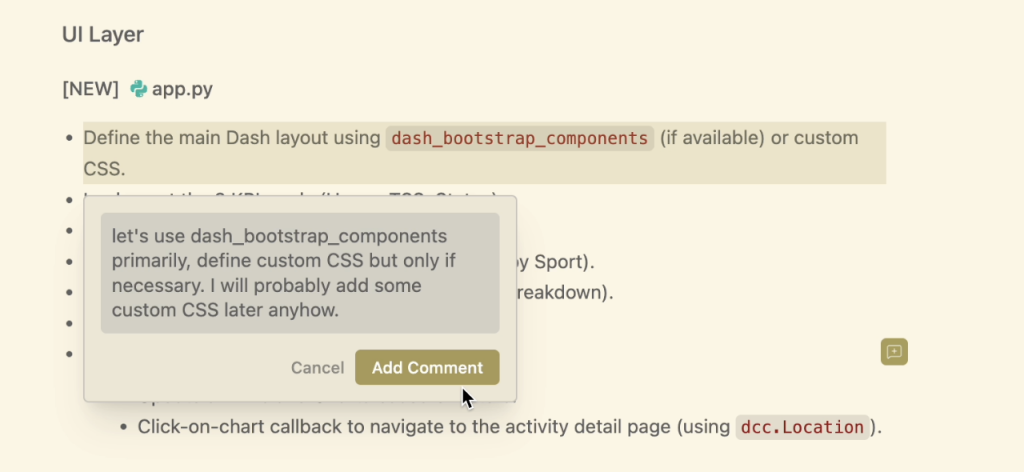
So I stopped trying to fine-tune the layout through prompting and took it into my own hands.
Where The Dashboard with Google Antigravity Fell Short (and Why That Was Fine)
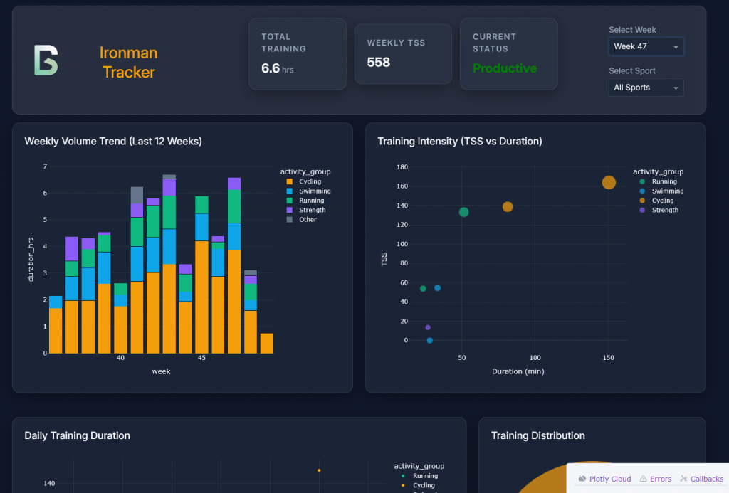
The layout was the first thing that needed attention.
Rather than continuing to prompt for incremental layout changes, I rewrote the HTML (within Dash) and added custom CSS using a flex layout to restructure the header entirely.
The updated layout placed:
- The logo and title on the left
- Key KPIs in the center
- Filters (week and sport selectors) on the right
This required refactoring how the KPI cards were structured and adding custom styling so they behaved as a cohesive unit rather than isolated components.
The goal wasn’t to add visual flair, it was to compress the information without removing the clarity. I wanted the most important information visible immediately, without scrolling.
Turning Interesting Charts into Useful Ones
Two charts needed more than cosmetic changes.
The first was a line chart showing daily training duration. In practice, it implied trends that weren’t really there.
I replaced it with a scatter plot showing daily training duration for the selected week, color-coded by sport. The result was simpler, clearer, and more honest about what the data represented.


The second issue was the sunburst chart.
While visually appealing, the original version didn’t accurately represent how my training time was distributed.
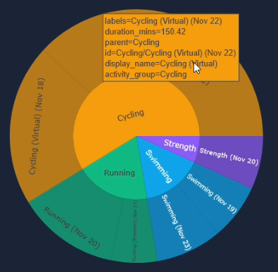
Originally, the sunburst chart was based on activity counts, not time, which made it visually appealing but misleading.
I updated the logic so it represented the percentage of total training time by workout type rather than a count of the activities by sport.
That one change fundamentally improved the chart.
In the updated version on the left, the breakdown between activities is driven by time spent, making it far easier to understand how my training is actually distributed.
After spending a few minutes iterating the charts, time-consuming work had been finished:
- App scaffolding
- Callback wiring
- Database integration
- Initial chart generation
From there, the remaining work required intentional design decisions and domain-specific judgment. That’s where manual control made more sense.
What This Reinforced for Me
Antigravity isn’t a replacement for understanding your data or your users. It’s a way to get to a working prototype fast enough that you can make those decisions sooner.
Instead of spending days just getting something to render, I was spending time deciding:
- What matters most?
- What questions am I actually answering?
- What’s noise?
10-minutes creating the dashboard with Google Antigravity changed how quickly an idea became a prototype, and how quickly that prototype became a useful dashboard.
Key Takeaways
- LLMs excel at scaffolding dashboards quickly, but they need explicit intent to make good design decisions.
- Fast prototypes surface design and data issues earlier, when they’re cheaper to fix.
- The real leverage comes from combining automation with domain judgment, not replacing it.
Getting Better Results from LLM-Generated Dashboards
One thing this project made clear is that the quality of LLM-generated dashboards, like the dashboard with Google Antigravity, is tightly coupled to the quality of the context you provide.
The early prompts were intentionally sparse. That helped with speed, but it also explains some of the layout and visualization choices that missed the mark.
When the output improved, it was usually due to two factors.
1. Be Explicit About Layout and Information Hierarchy
LLMs don’t naturally infer what matters most unless you tell them.
Adding guidance like:
- “Header with logo on the left, KPIs centered, filters on the right”
- “Above-the-fold should summarize weekly volume and intensity”
- “Avoid vertical stacking where possible”
produced noticeably better first drafts, even if manual refinement was still required.
2. Expand the Context Beyond the Data
Schema alone isn’t enough.
The outputs improved once I added context about:
- What decisions the dashboard was meant to support
- What I cared about as an athlete (e.g., avoiding sudden load spikes)
- Which metrics were explanatory versus descriptive
Once the model understood why the dashboard existed, not just what data was available, the charts and callbacks aligned more naturally with the problem.
The takeaway for me was to treat LLMs less like code generators and more like junior collaborators. Clear intent and constraints matter as much as technical detail.
Closing Thoughts
What this project reinforced for me is that the real bottleneck in building useful data products isn’t analysis or visualization, it’s the distance between an idea and a working prototype.
Google Antigravity dramatically shortened that distance.
By handling the scaffolding, callbacks, and data integration, it allowed me to move past setup friction and into higher-value decisions much earlier: what the dashboard should emphasize, what visual encodings actually made sense, and how the information should flow for someone trying to make real-world decisions.
The final dashboard wasn’t built by an LLM. It was built with one, where automation handled the repetitive groundwork and human judgment shaped the outcome.
That’s increasingly how I think about modern data work: less about replacing expertise, more about reclaiming time for it.
What’s Next
I’m planning to run a small, hands-on workshop focused on using tools like Antigravity, Claude Code, and Cursor to rapidly prototype custom dashboards and data applications, from raw data to something interactive and decision-ready.
This workshop is for people who are tired of spending most of their time wiring dashboards instead of deciding what the data should actually say.
The focus won’t be on polished demos or pre-built templates. It’ll be about:
- Going from messy data to a working app quickly
- Knowing when to let AI take over and when to step in
- Making pragmatic design and modeling choices under real constraints
If that’s something you’d be interested in, subscribe below. I’ll share details once I lock in the format.