Power BI has helped democratize dashboards by giving anyone, from aspiring data analysts to business managers, the tools to explore, visualize, and share insights.
Building a Power BI dashboard that looks good is easy, but building one that actually works takes intention.
In our last article, we looked at why most Power BI dashboards fail and the five common mistakes behind them.
This time, let’s fix them with five practical, easy-to-apply Power BI tips you can use today.
Power BI Dashboard Tips
1. Use Color With Purpose

The Problem: Too many colors compete for attention, creating visual noise and confusion.
The Fix: Simplify your palette. Create a three-color system: one accent color, one neutral base, and one alert color for exceptions.
- Accent color: For emphasis and highlights (use your brand tone or one bold hue).
- Neutral base: For backgrounds, cards, and supporting visuals; grays or off-whites work best.
- Alert color: For negatives, warnings, or deviations (red/orange).
Then use color to show meaning, not decoration. A bar chart that highlights “vs. target” or a KPI showing positive/negative change instantly adds clarity.
✅ Tip: Go to View → Themes → Customize Current Theme to lock your color palette across every visual in one click.
2. Group KPIs by Intent, Not Function
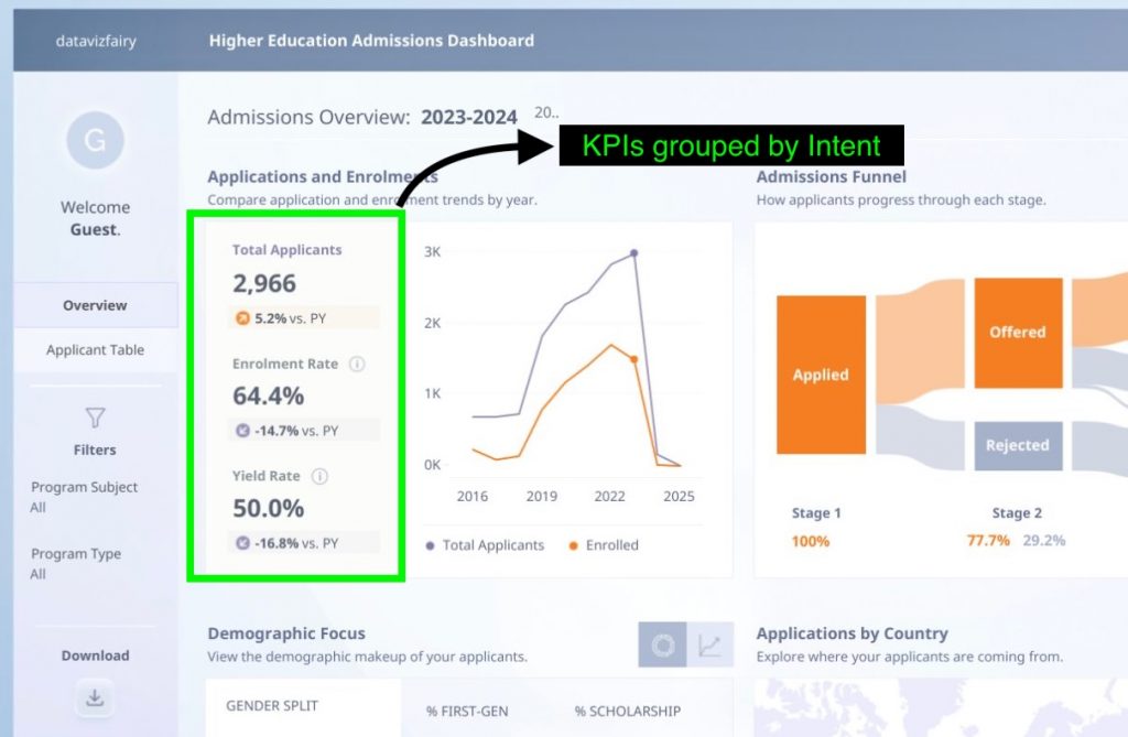
The Problem: Dashboards often turn into a wall of KPIs with 10+ metrics competing for space, none of which tell a story.
The Fix: Organize KPIs by intent, not department. This helps users read from summary → explanation → context.
- Headline KPIs: The core outcomes (e.g. Revenue, Growth, Retention).
- Diagnostic KPIs: The “why” behind results (e.g. Churn, CAC, NPS).
- Context KPIs: Comparisons or benchmarks (e.g. YoY, vs. target).
Lay these out visually in tiers with headline KPIs up top, diagnostics in the middle, and context below. You’ll instantly create a dashboard hierarchy that guides attention.
✅ Tip: Use section headers like “Overall Performance” or “Customer Trends” to make navigation intuitive for any audience.
3. Design With Visual Hierarchy
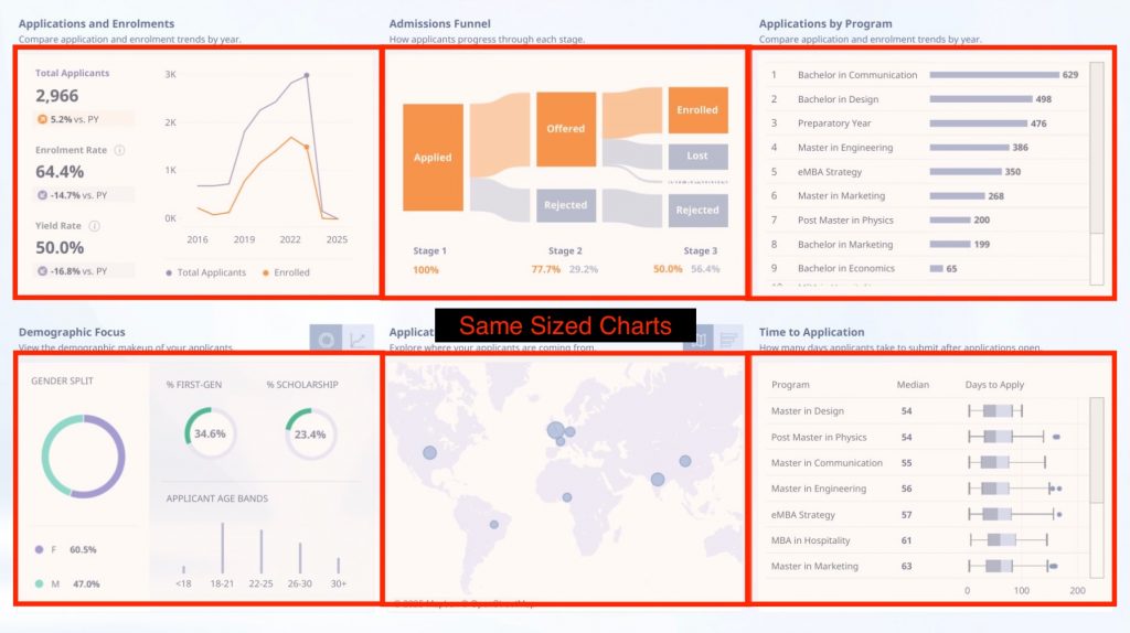
The Problem: Equal-sized visuals create visual chaos where users can’t tell what matters first.
The Fix: Build your layout intentionally, following natural scanning patterns (Z-shape or L-shape).
- Top-left: The summary or headline metric —> “How are we doing?”
- Middle: Driver charts —> “Why?”
- Bottom/right: Detailed breakdowns —> “What’s next?”
Use different visual sizes to signal importance, and leverage white space as a deliberate separator, this helps users breathe between insights.
✅ Tip: Turn on Snap to Grid (View → Snap to grid) to align visuals perfectly and maintain visual rhythm.
4. Keep Filters Simple (and Smart)

The Problem: Too many slicers cause confusion and slow down decision-making.
The Fix: Limit filters to the few that truly matter, usually time, region, and one key category.
- Hide less-used filters in a “Filter Panel” or apply them as report-level filters.
- Use dropdowns, not lists, to save space.
- Default filters to your most relevant period (e.g., Current Quarter).
✅ Tip: Use Sync Slicers to apply one filter across multiple pages; fewer slicers, cleaner design.
5. Add a Story Layer
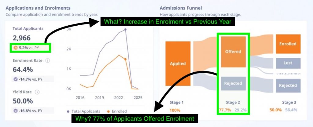
The Problem: Raw numbers alone don’t drive understanding. The users see data, but not meaning or insights.
The Fix: Bring storytelling into your visuals. Every chart should answer one of three questions: what happened, why it happened, or what to do about it.
- Use Smart Narrative visuals to automatically summarize trends.
- Add text boxes for quick summaries (“Q2 up 12%, driven by Product A”).
- Highlight inflection points with annotations or data labels.
✅ Tip: A dashboard is a visual story try to connect data points in a flow your audience can follow naturally.
Final Thoughts
These five tips build on the same principles we explored in “Why Most Power BI Dashboards Fail” –> clarity, hierarchy, and storytelling.
The difference now is in execution. When color, layout, and logic work together, your dashboard becomes more than a report, it becomes a decision tool.
Less noise. More insight. That’s the real measure of good design.
If you’d like a deeper look at these concepts, visit our earlier guide on Dashboard Design Principles.
About Data Sense
At Data Sense, we help teams turn messy dashboards into clear, actionable data stories through automation, design, and better data foundations.
Need a second opinion on your Power BI dashboard? Book a quick consultation and we’ll show you the small tweaks that make the biggest difference.
