Introduction: The Promise and Perils of Democratization

For decades, data visualization was the guarded domain of BI specialists, statisticians, and data analysts. If an executive wanted a dashboard or a policymaker needed an analysis, they had to request it through a central analytics team and wait days or weeks for results.
That world is gone. Today, thanks to platforms like Tableau, Power BI, and open-source frameworks such as Plotly Dash and Plotly Studio, almost anyone can spin up an interactive dashboard. This shift, known as the democratization of data visualization, promises faster insights, broader participation, and fewer bottlenecks from overworked data teams or gaps in expertise.
But the democratization of data visualization isn’t free of costs. Our recent Data Sense video review of Plotly Studio highlighted “the good, the bad, and the ugly” of this trend. What became clear is that democratization without underlying knowledge, governance, standards, and training can confuse, fragment, and even mislead.
This article examines the pitfalls organizations face, the opportunities to get democratization right, and what the next generation of platforms will bring to the table. At Data Sense, we’re exploring these ideas in SimBI, our upcoming Agents-as-a-Service platform. More on that soon.
The Pitfalls of Democratizing Data Visualization Platforms
Free-for-All Syndrome: Security and Privacy at Risk
When access is opened to everyone, the first casualties are often security and privacy. It’s not hard to imagine a well intentioned employee pasting an API key into a public dashboard or uploading a sensitive dataset to a shared workspace. In fact, this is a scenario we’ve observed repeatedly across organizations.
What looks like a harmless shortcut can quickly escalate into a data breach or compliance violation. In highly regulated industries like finance, healthcare, government, and logistics the risks are amplified. Through our work across these sectors, we have seen firsthand the consequences of insufficient governance, standardization, training, and oversight.
Furthermore, silos amplify the problem by allowing different teams to define the same data in different ways.
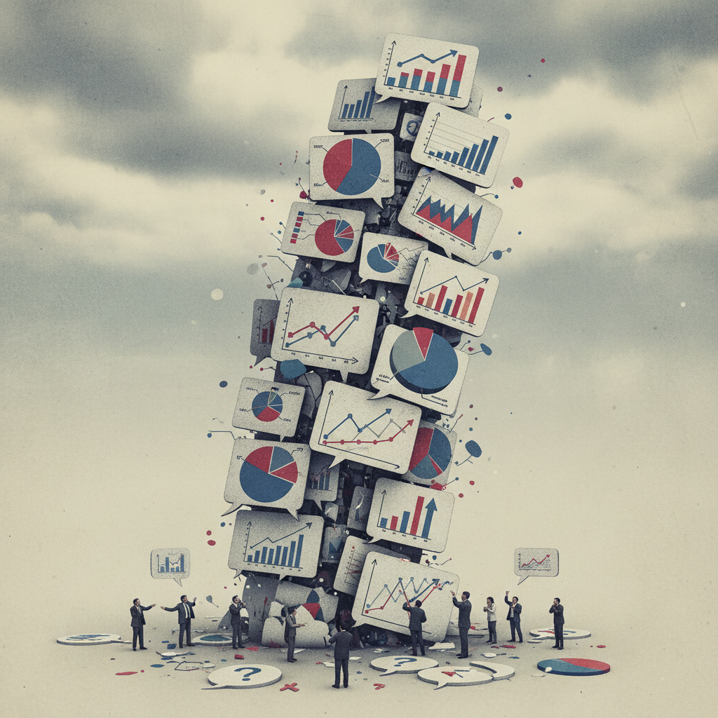
The Tower of Babel Effect: Conflicting Interpretations

The same dashboard can tell different stories depending on who reads it. A “growth” figure might be interpreted as revenue growth by one team, user growth by another, or even gross margin expansion by finance.
This fragmentation undermines the whole point of visualization… clarity. The danger is that leadership discussions become arguments over definitions rather than strategy and decisions are made off of uncertainty.
Yet there’s nuance here. Different perspectives can also spark productive dialogue. When teams are forced to explain how they interpret a metric, it can lead to more robust decisions. The challenge is balancing diversity of interpretation with standardized definitions.
And when multiple interpretations circulate, the response is often to produce more dashboards, adding noise rather than clarity.
Quantity Over Quality: More Dashboards, Less Clarity
Democratization often produces a flood of charts and dashboards. But more dashboards don’t automatically mean better decisions.
Without training, users frequently choose the wrong visualization for the data (think pie charts for time series), omit necessary context, or stretch axes in misleading ways. The results may look polished but distort reality. Decision fatigue sets in, or worse, poor decisions are made on faulty analyses.
When teams believe their tools or analyses are superior, silos harden, fragmenting the organization’s view of the truth.
Tool Fragmentation: Multiple Versions of the Truth
In an ungoverned environment, teams gravitate toward the tools they like. Marketing may prefer Tableau, finance may live in Excel, IT may adopt Power BI, while a technical subgroup experiments with Plotly or R Shiny.
This results in duplicative efforts and “multiple versions of the truth.” Instead of democratization unifying an organization, it fractures it further.
Finally, even when the right tools are chosen, a deeper challenge remains. Without understanding the data itself, dashboards can look convincing while concealing fundamental flaws.
Lack of Data Knowledge: Polished but Misleading Dashboards
Perhaps the most insidious problem is when polished dashboards mask bad data.
During our review of Plotly Studio, we encountered an inflation dataset that displayed implausibly large values. A trained analyst would immediately spot the red flag and be able to diagnose the underlying issue in the code. But a less experienced user might accept the numbers at face value or not know where to look to identify what is being presented.
If that dashboard landed on the desk of a policymaker or senior executive, critical decisions could be made on unreliable foundations. And in the free version of Plotly Studio, users may not even have the ability to inspect the underlying code to validate what they’re seeing.
Best Practices for Responsible Democratization
The answer is not to roll back democratization but to guide it responsibly. Here are three pillars organizations should adopt:
Governance and Training: Raising the Baseline

Giving everyone access to visualization tools without governance is like giving everyone AI copilots without rules. The potential is huge, but the risks are greater.
Organizations must embed governance: role-based access controls, audit trails, and policies for handling sensitive data. At the same time, they must invest in ongoing training to raise the baseline of data literacy. Even modest training on chart types, axis scaling, or definitions of key metrics can dramatically reduce the risk of misleading dashboards.
Unified Standards: Building a Shared Language
Standards are the antidote to the Tower of Babel. They create a shared language for metrics and visuals.
For example, organizations should define and enforce consistent interpretations of metrics: “revenue” always means net revenue, “inflation” always refers to CPI . Likewise, they can standardize visuals: line charts for time trends, bar charts for categorical comparisons, scatterplots for relationships.
These small but critical steps ensure that dashboards tell consistent stories across divisions and reporting cycles.
Leaning on Strengths, While Knowing the Limits
Our Plotly Studio review praised the platform’s flexibility and accessibility. Technical and semi-technical users alike can quickly create advanced, interactive charts.
But the same flexibility can backfire without proper guardrails. Misconfiguration, unclear data provenance, or governance gaps can lead to confusion. Democratization magnifies both strengths and weaknesses; organizations need to account for both.
From Access to Trust: The Next Generation of Visualization

If the first generation of democratized visualization was about access, the next generation must be about trust. The future lies in platforms that bake governance, standards, and collaboration into their design.
So what does this look like?
1. Guardrails by Design: Security First
Platforms should enforce access control and secure data handling by default. API keys as environment variables, sensitive fields, and permissions shouldn’t be afterthoughts, they should be part of the core architecture.
2. Templates and Standards by Default: Reducing Error
Instead of starting from a blank canvas, users should build from vetted templates. Imagine pre-built dashboards for revenue monitoring, inflation tracking, or portfolio analysis.
3. Integrated Governance: Transparency Built In
Governance should be invisible but omnipresent: access logs, version control, data lineage, and metadata definitions. Much like GitHub transformed code collaboration with versioning and transparency, visualization platforms need the same for dashboards.
4. Scalable Analytics for Sensitive Environments
Most current platforms weren’t designed for regulated industries. Yet sectors like finance, insurance, healthcare, and logistics need both flexibility and compliance. The next wave of platforms must scale securely while meeting the demands of risk-sensitive environments.
Bridging to the Next Generation: SimBI
This is exactly the gap the next generation of tools will fill. At Data Sense, we’re building SimBI as an example of what responsible democratization looks like.
SimBI is not designed as another AI-assisted DIY visualization tool but as an Agents-as-a-Service platform that balances accessibility with governance. Its foundation rests on lessons from the pitfalls above:
- Controlled access by default: Permissions and roles are embedded into the platform, ensuring sensitive data is protected and audit-ready.
- Standardized templates: Teams build from pre-approved, auditable dashboards, where defined KPIs promote consistency and comparability across the organization.
- Integrated governance and data management: Cleaning, metadata, and provenance are built in, helping organizations align with frameworks like DCAM, DAMA-DMBOK, and the EU Data Governance Act (DGA).
- Scalable for regulated environments: Designed with compliance and security in mind, providing a trusted environment to democratize analytics without risk.
By addressing the shortcomings of today’s democratized platforms, SimBI represents the next wave of tools. Tools that empower users while ensuring that insights are reliable, consistent, and secure.
Conclusion: From Dashboards That Dazzle to Dashboards That Deliver

The democratization of data visualization is irreversible, and that’s a good thing. Tools like Plotly Studio have expanded access and lowered barriers. But our review, and broader industry experience, show that accessibility without responsibility can create risks: free-for-all dashboards, inconsistent interpretations, silos, and misplaced trust in unreliable data.
The path forward isn’t more dashboards, it’s better ones. That means embedding governance, enforcing standards, and designing platforms that balance freedom with oversight.
The next era of the democratization of data visualization will be defined not by how many dashboards anyone can build, but by how much organizations can trust the dashboards they use to make decisions. Today’s platforms have opened the door. The next wave will make it responsible. At Data Sense, we’re shaping this future with SimBI. More on that soon.
