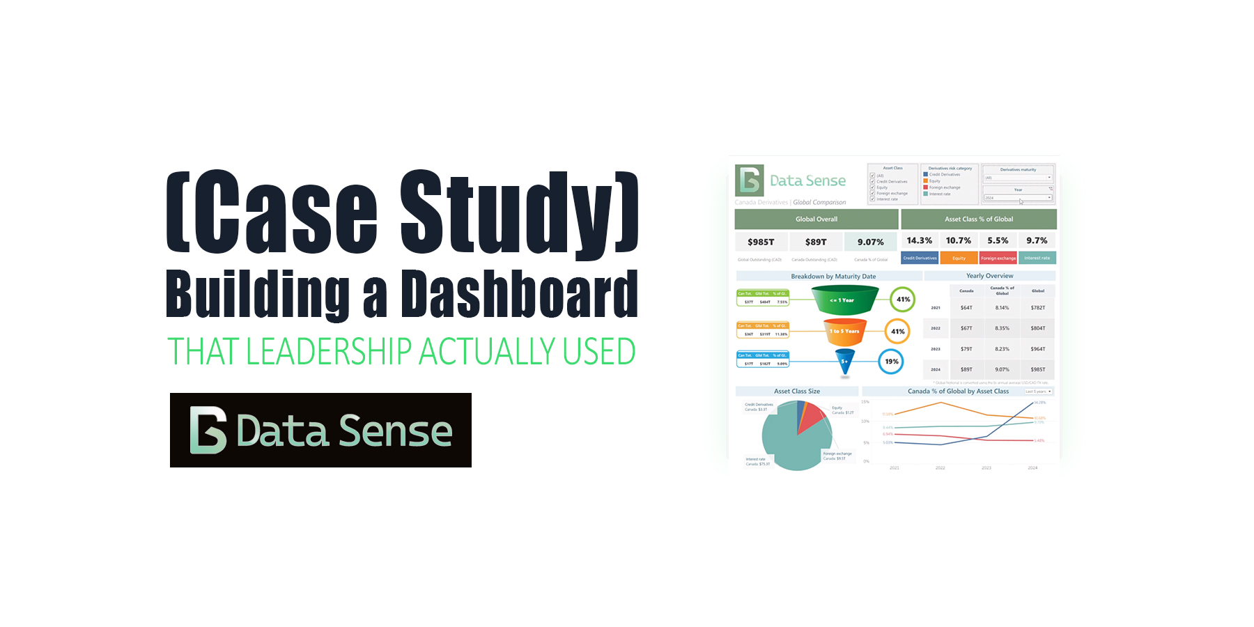
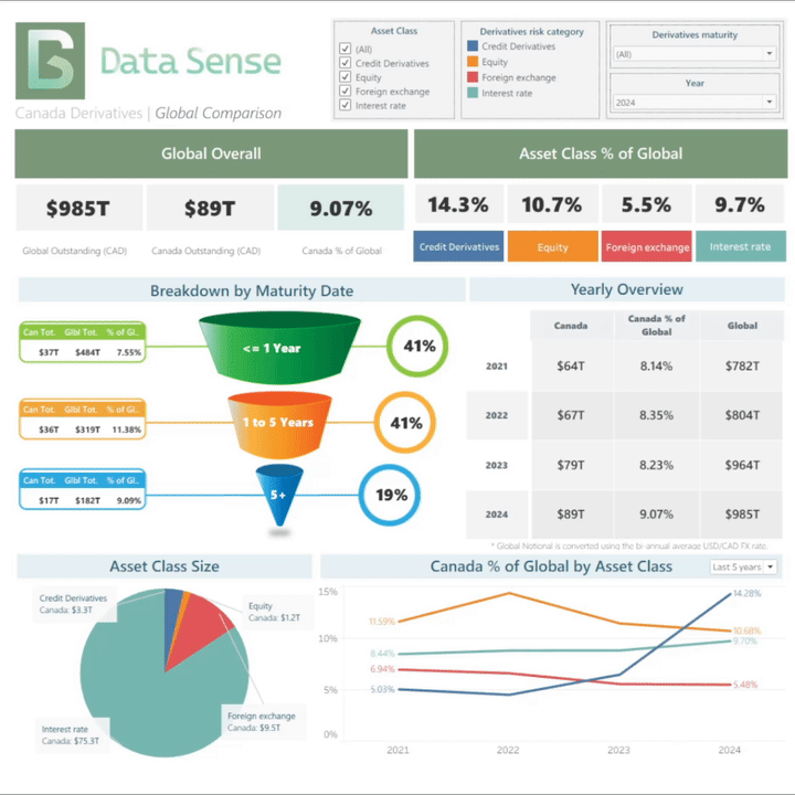
Five years ago, I built one of my first full Tableau dashboards, and, more importantly, a dashboard that leadership actually used.
The goal: give a clear, defensible, and up-to-date picture of Canada’s OTC derivatives market relative to the global market.
Before this project, leadership relied on rough approximations, scattered spreadsheets, and outdated public sources. Finding a simple answer to — “What is the size of Canada’s OTC Interest Rate derivatives market relative to the Global OTC Interest Rate derivatives market?” — could take days.
This dashboard changed that.
The Challenge
The underlying data was messy, split across multiple public and confidential sources, and required careful FX conversion, maturity bucketing, and validation.
- There was no central place to see Canada’s OTC derivatives footprint
- Numbers were difficult to validate
- Leadership, policy lawyers and derivatives analysts needed answers immediately when preparing briefs, speaking in international forums, or discussing systemic risk
This project needed to deliver clarity, speed, and confidence. In doing so, this would ensure it was a dashboard that leadership would actually use.
Building the Dashboard
Design Philosophy
Long before I had written about Dashboard Design Best Practices, I was focused on clarity.
I optimized for two things:
- Clarity — stakeholders should get the key answer (Canada’s percentage of global IR derivatives) in 5–10 seconds.
- Visual appeal — something that looked polished enough that leadership would actually want to use it.
Key Visuals
- Line charts – to show the long-term trend of Canadian vs global notional
- Pie chart – to break out asset classes and highlight which products dominated
- Funnel-style breakdown – to explain maturity buckets and notional distribution
- KPI tiles – fast-glance indicators of market size, growth, and share
Subscribe or follow Data Sense for insights on AI-driven data careers, dashboard design, and workflow automation. Join our newsletter or upcoming workshop series on “Integrating AI into Financial Analytics” — practical, project-based, and built for professionals who want to stay ahead of the curve.
Data & Technical Work

- Python scripts to clean, join, and convert data (including FX conversions)
- Custom calculations in Tableau using VizQL and DAX-style expressions
- Grid-based layout with floating tiles to achieve cleaner hierarchy
- Iterative design testing; several early versions were scrapped before the final layout emerged
- Deployment via Tableau Desktop → Tableau Server for organization-wide access
The Good
- Clean visual hierarchy — intentional spacing, typography, and chart ordering made the dashboard scannable for non-technical audiences.
- Color contrast and structured layout — Canada vs Global was instantly distinguishable, clear color scheme for asset classes.
- KPI-style top section — fast-glance metrics worked well and remain a go-to pattern in my dashboards today.
- Asset-class breakdown with annotations — pie chart annotations added context and made categories intuitive.
- Useful, not flashy — visually polished yet simple enough for actual policy work.
The Bad
- Too much information at first — can be overwhelming when only a few metrics mattered.
- Highlighter + filter redundancy — the filter was all users needed; the highlighter was visually cool but practically useless.
- Too many decimals — a calculation to show one or two decimal places would have been better visually, but Tableau limits this ability.
- Semi-manual updates — Python ETL automated most work, but scheduled jobs would have made updates fully hands-off.
Impact & Outcomes
Before the dashboard: derivatives analysts spent days hunting and reconciling data, leadership relied on rough estimates, and policy lawyers were left scrambling for answers.
After the dashboard: users self-served the answer in minutes with far more confidence.
Who actually used this information?
- Policy lawyers
- Derivatives analysts
- Senior leadership
- Risk Committee
Use cases included prepping policy briefs, internal senior-leadership updates, systemic risk discussions, business conduct rule design, and an annual published report.
Key Lessons Learned
One-sentence summary: Keep it simple.
- Start with stakeholder questions, not charts — if you don’t know the one metric they care about, you will build the wrong thing.
- Simple beats impressive — users need clarity, not artistry.
- Automate the pipeline early — manual updates kill adoption.
- Iterate. Then iterate again — early versions were wrong, and fixing them taught more than building them.
Dashboards That Leadership Actually Use

At Data Sense, we help organizations design dashboards that go beyond pretty charts. Dashboards that clarify, simplify, and support real decisions. If you’re looking to create automated dashboards that align with best practices and deliver impact, get in touch with us.
Disclaimer
This analysis, dashboard design, and accompanying commentary represent my own work and perspectives, based on publicly available data from DTCC, ICE, CME, and the BIS. All interpretations, calculations, and visualizations were created independently and do not represent the views, positions, or official analysis of any past or current employer, regulatory body, or affiliated organization. Any errors or omissions are my own.