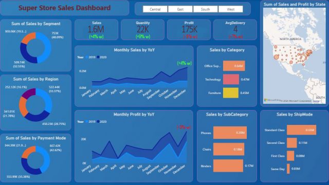
Power BI has helped democratize dashboards by giving anyone, from aspiring data analysts to sales managers, all the tools to build one.
Sadly, most of these dashboards end up in a folder somewhere never getting the attention they deserve.
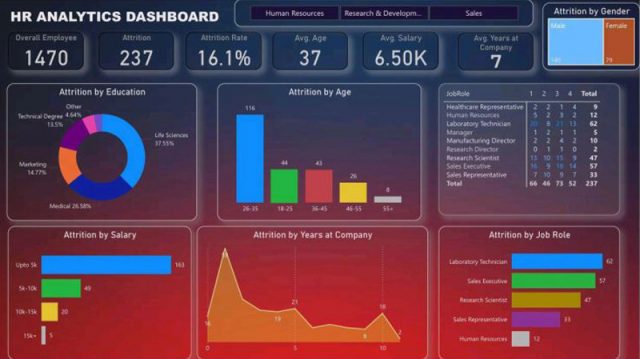
Sometimes the issue is design; cluttered layouts, overuse of color, inconsistent filters. Other times, the data itself is messy, misaligned, or misunderstood.
The result? Dashboards that look impressive but fail to inform.
I’ve reviewed hundreds of Power BI dashboards being posted on LinkedIn, and the same five mistakes show up again and again.
Here’s how to fix them in minutes (no fancy visuals required).
TL;DR
The 5 Most Common Mistakes in Power BI Dashboards
1. Too Many Colors
The Problem
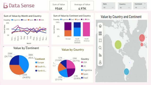
Power BI makes it easy to color everything, every bar, card, and slicer. But more color often means less clarity. When every visual screams for attention, the viewer doesn’t know where to look.
The Fix
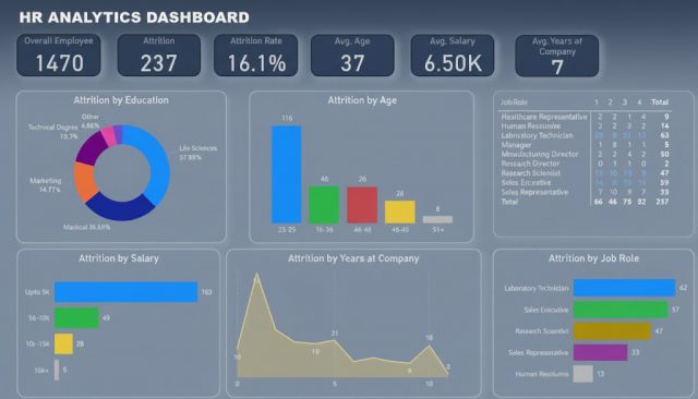
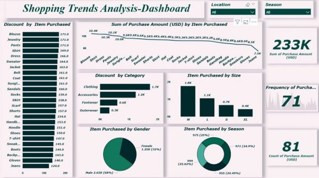
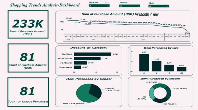
Pick one accent color for emphasis, and make everything else neutral.
Use contrast only when it adds meaning. For example, highlight performance vs. target or positive vs. negative change.
✅ Tip: In Power BI, go to View → Themes → Customize Current Theme to set consistent colors across visuals.
2. The KPI Soup Problem
The Problem
Dashboards often turn into metric dumps — 15 KPIs squeezed into one page, each in its own card.
Users see “Revenue,” “Churn,” “Net Promoter Score,” “ARPU,” and “Cost per Lead”… and then give up.
The Fix
Group metrics by intent.
- Headline KPIs: What executives care about at a glance.
- Diagnostic KPIs: What analysts use to explain changes.
- Context KPIs: Benchmarks, trends, or YoY comparisons.
✅ Tip: Give each section a short, human-readable title — e.g., “Overall Performance” or “Customer Trends”.
3. Ignoring Hierarchy
The Problem
When every chart on a Power BI dashboard is the same size and shape, users have no sense of what’s most important. The eye wanders. You end up with a grid of visuals that look balanced but read confusingly.
The Fix
Design using intentional layout hierarchy and follow the natural eye-tracking patterns we explored in the previous article:
- Top-left corner: Should answer “How are we doing overall?” — the key metric or summary view.
- Middle area: Should answer “Why?” — charts or visuals explaining drivers and trends.
- Bottom or right side: Should provide detail and context — supporting tables or segment breakdowns.
Depending on your dashboard shape, this often follows either a Z-pattern (for landscape layouts) or an L-pattern (for tall, scrollable pages).
These mirror how people naturally scan screens from top to bottom and left to right, so structure your visuals to guide that motion intentionally.
✅ Tip: Use white space as a design tool, it’s not “empty space,” it’s breathing room for your data.
4. Cluttered Filters & Slicers
The Problem
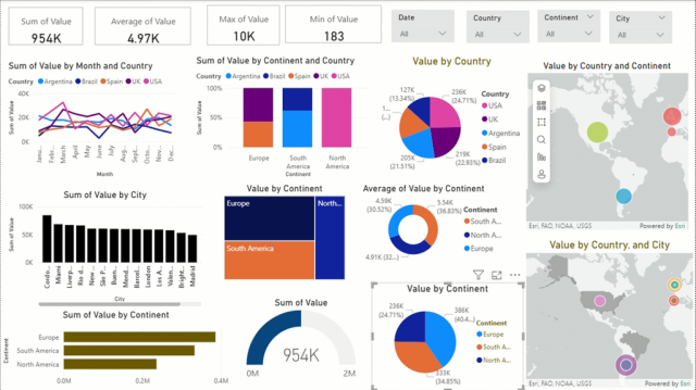
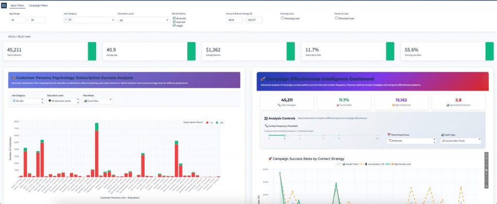
You’ve probably seen this one: a Power BI dashboard with 10 slicers stacked along the side; region, date, product, salesperson, customer segment, and so on.
The more filters, the slower the decision.
The Fix
Apply the Pareto principle and keep only the filters users truly need.
Move the rest to a separate “Filter Panel” page or apply them as report-level filters.
✅ Tip: Use dropdown slicers (not lists) to reduce visual clutter.
5. Telling Data, Not Stories
The Problem
Dashboards often stop at showing raw numbers lie “Revenue = $1.2 M” and fail to deliver real insights. The data alone doesn’t tell users what changed or why it matters.
The Fix
Add context and narrative directly in Power BI:
- Combine KPIs with comparison metrics (“▲ 12% YoY”)
- Add text boxes for summary insights (“Q2 growth driven by Product A expansion”)
- Use Data Labels and Annotations in charts to highlight key points.
✅ Tip: A dashboard is your narrative canvas, use it to connect data points into a sequence users can follow effortlessly.
If you’d like to explore this idea further, we broke down the principles of effective data storytelling — including structure, types of analysis, and visual cues — in Telling Amazing Stories with Data.
Final Thoughts on Power BI Dashboards
The rise of self-service tools like Power BI has empowered anyone to build dashboards but it’s also flooded organizations (and LinkedIn) with visual diarrhea.
Design and data quality are now both part of the same problem.
A clean, reliable dashboard isn’t just about aesthetics; it’s about trust.
When your data is accurate and your design intentional, users start to believe in what they see and more importantly — act on it.
If you found these tips helpful, you might enjoy my earlier article on Dashboard Design Principles: Clarity, Context, and Contrast
About Data Sense
At Data Sense, we help teams turn messy dashboards into clear, actionable data stories. Whether that means better data foundations, automation, or design.
If you’d like a second opinion on your Power BI dashboards, book a quick consultation. We’ll help you identify the small changes that deliver the biggest clarity gains.
