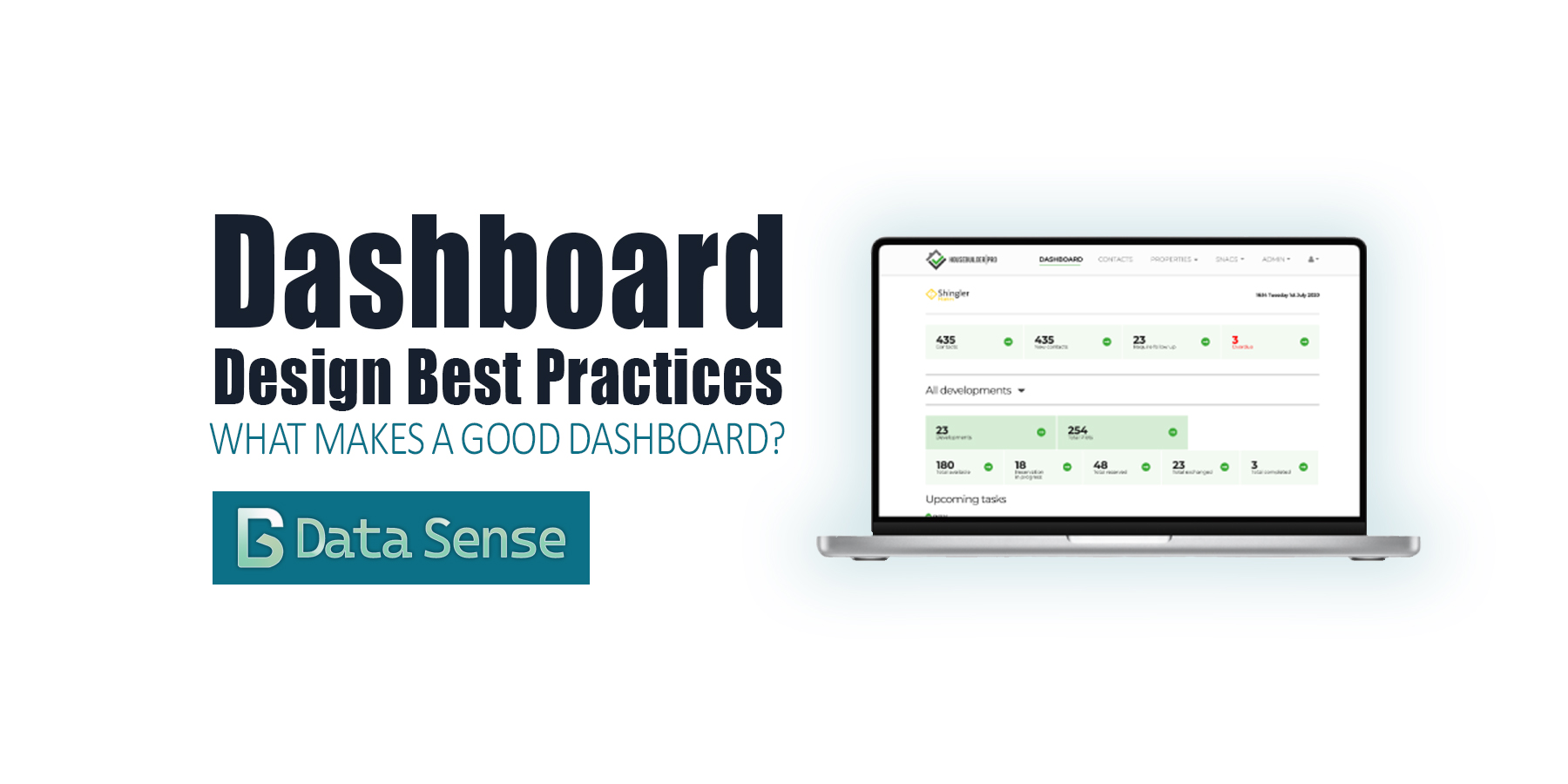
Introduction: Beyond Pretty Charts
Over the past few years, dashboards have become ubiquitous. Thanks to the “democratization of data visualization tools,” everyone is suddenly an analyst. With drag-and-drop interfaces and endless templates, it’s never been easier to pull data into a dashboard and share it with colleagues or executives.
The problem? Most dashboards are bad. They don’t follow dashboard design best practices.
You’ve probably seen them shared on LinkedIn: messy color schemes, overcrowded with charts, crammed into tiny panels, or spread across dozens of pages. They look neat, but they don’t communicate. At best, they confuse. At worst, they actively mislead.
Executives don’t have time to dig through clutter. A dashboard should surface the most important information immediately. If that means splitting into multiple dashboards rather than one giant catch-all, so be it.
At its core, a dashboard isn’t a visual dumping ground. It’s a communication tool. A good one has a clear purpose, a defined audience, and a refined story.
So, what makes a good dashboard? Well, before we judge, let’s define what a dashboard really is.
What Is a Dashboard?
Stephen Few, author of Information Dashboard Design, defines a dashboard as:
“A visual display of the most important information needed to achieve objectives, arranged for at-a-glance monitoring.”
This definition gets to the heart of it: dashboards exist to surface critical information at a glance. They are not reports, not databases, not BI sandboxes… they are decision support tools.
Key Principles of Dashboard Design: Best Practices for Effective Dashboards
Following established dashboard design best practices helps ensure executives and analysts can interpret data at a glance and act quickly.
A. Clarity and Visual Hierarchy
The best dashboards make information effortless to interpret. They are clear and easy to read, placing the key information within the readers natural eye movements.
how to do it?
- Accessible charts: Use a small, contrasting set of colors so users can quickly distinguish metrics or chart series (tip: 3–5 high-contrast colors).
- Logical placement of metrics: Position critical metrics at the top or left to align with natural eye scanning patterns.
- Grouping: Organize related data together, reducing clutter and cognitive load (tip: use padded boxes or cards to guide readers to the most important information).
- Layout patterns: Apply common designs like F-shaped or Z-shaped layouts to guide the eye efficiently across the dashboard.
The design should make the “purpose” immediately visible, not buried in “noise”.
B. Simplicity and Minimalism
When designing a dashboard, a key phrase to keep in mind: less is more. It shouldn’t take the reader more than a 5-seconds to identify the main point of the dashboard.
how to do it?
- Limit visuals: Show only essential metrics and charts to keep the dashboard focused and easy to interpret.
- Follow the 5-second rule: Users should be able to grasp the main insights almost instantly (tip: review the dashboard with a stopwatch!).
- Use whitespace effectively: Give sections breathing room so users can scan and interpret information without feeling overwhelmed.
Remember, the goal is not to prove how much data you have. It’s to make the right data clear.
C. User Relevance and Customization
Dashboards should reflect the needs of their users, not the curiosity of the analyst. It should allow some flexibility in the use, and provide drill-down when necessary.
how to do it?
- Know your audience: Interview stakeholders, define personas, and design around their specific goals.
- Allow flexibility: Add filtering, drill-downs, and responsive custom views to let users explore data without overloading the main view.
- Keep it accessible: Not everyone is a data expert. Ensure information is clearly labeled and easy to understand.
- Timeliness: Users should be able to identify when the data was updated and what timeframe the data applies to.
A dashboard for a CFO will look very different from one for a product manager. The key is to know your audience and make the dashboard flexible and accessible for users who need to explore the data further.
D. Responsiveness and Accessibility
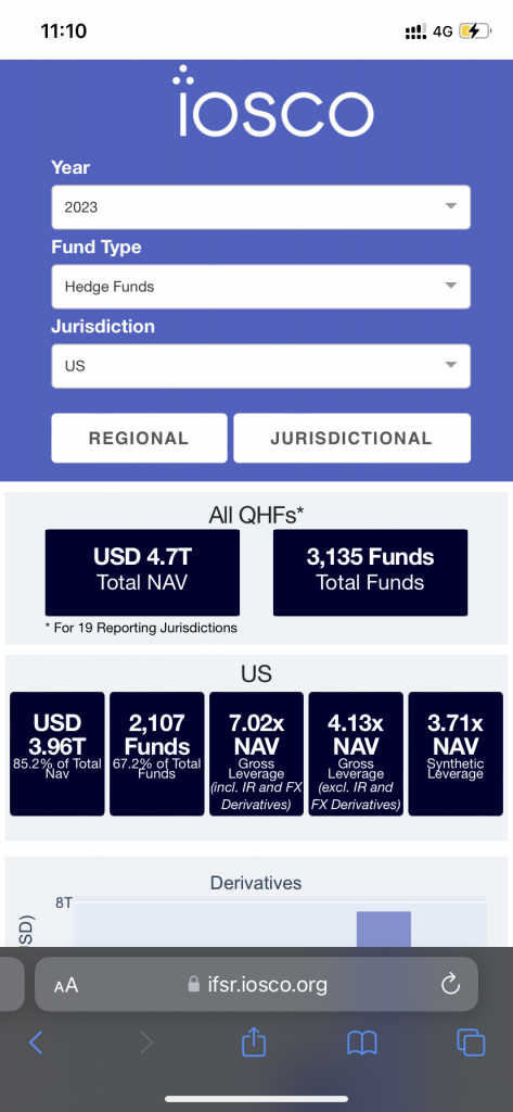
Dashboards are increasingly viewed across devices and contexts. Good design adapts to the device and incorporates data visualization for mobile devices.
how to do it?
- Multi-device design: Test dashboards on desktop, tablet, and mobile to ensure layouts remain clear.
- Accessible colors and fonts: Use legible font sizes, clear labels, and color schemes suitable for all users (tip: keep the color scheme and fonts inline with brand guidelines).
- Guided navigation: Structure interactions so users can explore data without confusion or getting lost in filters.
Accessibility isn’t a “nice to have.” It’s a professional requirement if you want real adoption.
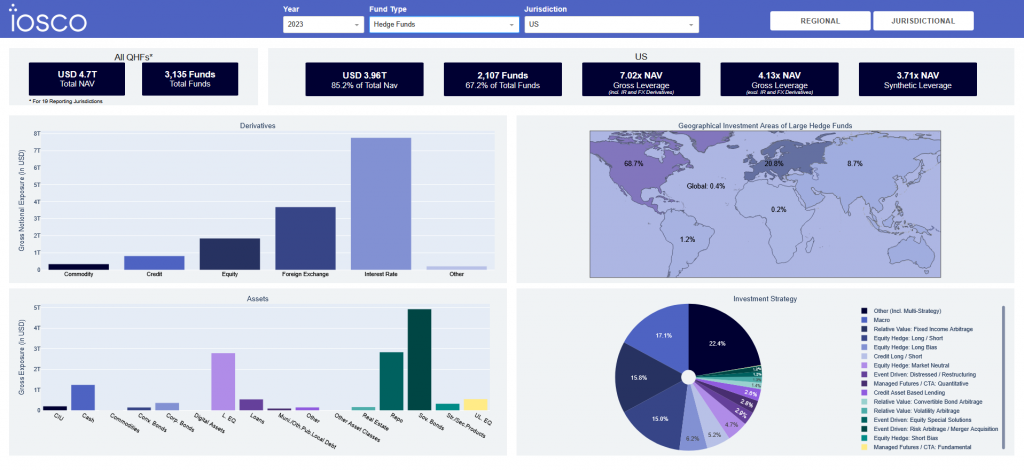
Examples of Dashboard Design Best Practices from IOSCO’s IFSR
The IOSCO Investment Funds Statistics Dashboard (IFSR) demonstrates how dashboard design best practices can be applied to a real-world, complex dataset.
Here’s how it aligns with the principles we’ve discussed:
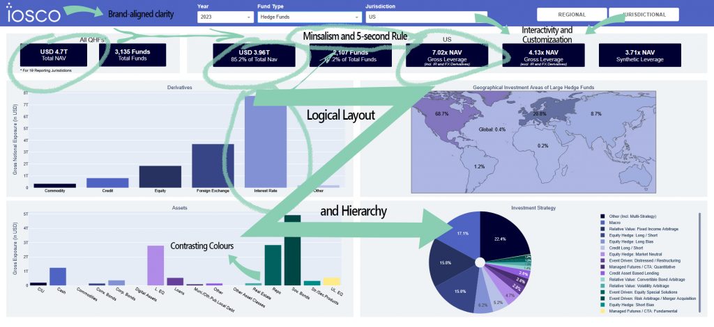
The dashboard uses consistent brand colors while maintaining sufficient contrast, making the dashboard readable and visually cohesive (tip: check color contrast ratios to meet accessibility standards).
Organizes information in a Z-pattern, with key metrics top-left and visual data flowing naturally to the right and downward. This improves scan efficiency and helps users spot insights immediately.
Supports filtering, drill-downs, and responsive views, giving users flexibility to explore data without cluttering the main dashboard.
Only essential charts and metrics are shown upfront, ensuring users grasp main insights quickly.
Adapts cleanly across desktop, tablet, and mobile, preserving readability and usability on all screens.
Metrics like leverage figures are calculated uniformly across jurisdictions, allowing users to make meaningful comparisons.
Granular disclosures and rigorous validation improve accuracy and reliability, making insights trustworthy.
Logical flows and grouped sections help users find what they need without confusion.
By applying these principles, the IFSR dashboard transforms a complex global investment dataset into an intuitive, accessible, and actionable tool. This example clearly shows how good dashboard design can make a real impact.
Common Dashboard Design Mistakes
Many of these mistakes come from ignoring dashboard design best practices. From overloading users with too much data to hiding key metrics behind clicks, even with clear principles, many dashboards fall into the same traps:
- Cognitive overload: trying to show everything at once.
- Hidden priorities: burying the most important KPIs behind filters or secondary table.
- Cluttered visuals: too many colors, chart types, or metrics competing for attention.
- Outdated or static data: a dashboard is only as good as its refresh cycle.
Avoid these, and you’re already ahead of most of the “data analysts” sharing dashboards on LinkedIn.
Summary of the Key Elements of What Makes a Good Dashboard
As we have seen with the IFSR dashboard, in both research and practice, strong dashboards share these traits:
- Comprehensive but focused data aggregation – e.g., IFSR consolidates many different funds data into jurisdictions and regions.
- Transparency and comparability – metrics are calculated consistently, enabling apples-to-apples insights and comparability.
- Data quality and usability – rigorous submission assessment and validation improve reliability.
- Relevance and timeliness – updated annually to ensure decisions rely on current data.
- Accessibility and guided navigation – layouts designed to be intuitive, even for non-experts.
A good dashboard structure is complemented by effective design and visualizations.
Summary of Dashboard Design Best Practices
Beyond structure, good dashboards also respect visualization fundamentals. Effective dashboards use layout, whitespace, and visual hierarchy to guide attention. These best practices in dashboard design make insights more accessible without overwhelming the user.
- Light or neutral backgrounds improve clarity and focus attention on data.
- Use hierarchy in chart size, placement, and color to guide attention.
- Cluster related details and apply whitespace to create clear scanning zones.
- Avoid chart junk: keep titles, labels, and legends concise.
Good visualization is invisible, it doesn’t draw attention and it lets the data speak for itself.
Conclusion: Principles in Practice
A good dashboard is not just a collection of charts, it’s a communication tool. It:
- Has a clear purpose and audience.
- Surfaces the most important information at a glance.
- Uses clarity, simplicity, and hierarchy to reduce cognitive load.
- Remains responsive, accessible, and up-to-date.
At Data Sense, we built the Investment Funds Statistics Dashboard (IFSR) with exactly these principles in mind. The dashboard aligns with global standards (IOSCO), organizes metrics for at-a-glance scanning, and ensures transparency and comparability across jurisdictions. By focusing on clarity, usability, and accessibility, we turned complex data into an intuitive decision-support tool.
Build Dashboards That Actually Work

At Data Sense, we help organizations design dashboards that go beyond pretty charts. Dashboards that clarify, simplify, and support real decisions. If you’re looking to create automated dashboards that align with best practices and deliver impact, get in touch with us.